Product
Customers
Pricing
Resources
Try a Demo Proof
Login
Try for Free
Insights, tips, and updates from the world of creative collaboration and online proofing.
Ashore Launches PDF Watermarking: Protect Your Creative Work While It's Still in Review
Ashore Launches Artwork Intake Forms: Turn Every Customer Submission Into a Ready-to-Proof Job
Ashore Now Supports Word Document Proofing: Review and Approve Copy Without Leaving Your Browser
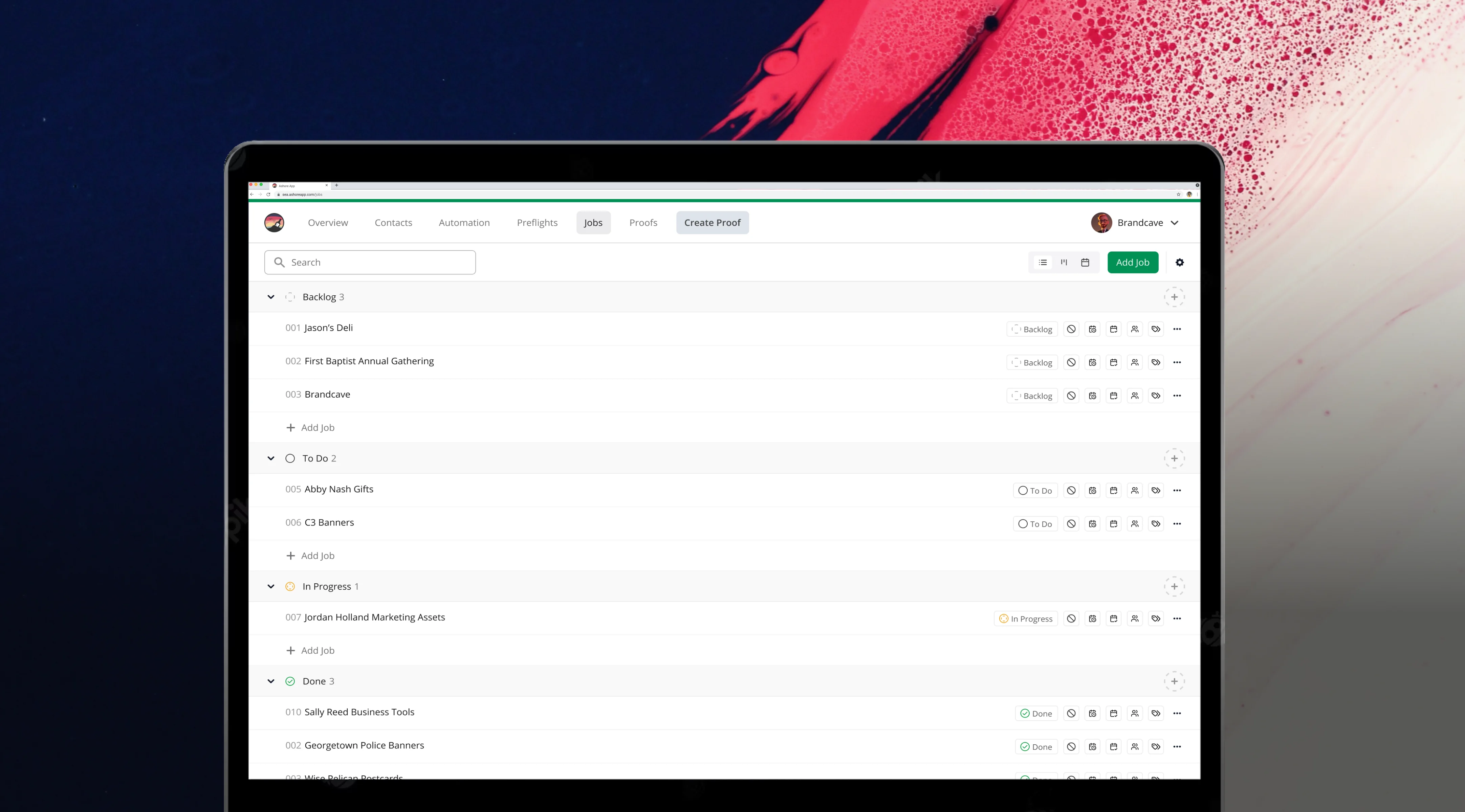
Introducing Ashore Job Tracking: A New Way to Organize and Track Projects
The Surprising Cost-Savings of Automated Preflight Software
Preflight Software Will Save You From Costly Errors
Here’s What’s On Our Preflight Printing Checklist
Ashore Launches Preflights: Make Print-Ready PDFs in Seconds
With Workfront Discontinuing, Ashore App is the Ideal Alternative
Ashore App Unveils Two Plugins for Adobe Creative Cloud
Streamline Printing with Print Shop Software Solutions
The Types of Printing in Today’s Digital Age
Crafting Visual Stories Through Collateral Design Strategies
Navigating the Pre-Press Process From Start to Print
The Impact of the Image Proof on Projects
The Future of Digital Press Printing Techniques
Why a Color Proof Is Important for Maintaining Brand Consistency
Navigating the World of Prepress Solutions
Picture Proofs: The Key to Streamlined Photography Edits
Transform Teamwork With Creative Collaboration Software
How Soft Proofing is Enhancing The Design Process
Why An Advertising Proof Is Essential in Marketing
Streamline Revisions with a Web Design Feedback Tool
Digital Proof Production in Modern-Day Workflows
Elevating Efficiency with Digital Photo Proofing
Leveraging Online Creative Feedback Tools in Remote Teams
The Preventative Power of a Printers Proof in Printing
Press Release | Ashore Reveals New Digital Proofing Experience
How A Virtual Sample Advances Sustainable Design Practices
How Print Technology Revolutionized the Pre-Production Sample
The Art and Strategy Behind Effective Website Imagery
The Importance of Print Proofing in Print Accuracy
The Design Proof Journey from Sketch to Reality
The Guide to Gathering Feedback on Website Design
How The Proof Print Review Enhances Printing Accuracy
The Ultimate Graphic Design Checklist for Clients
Maximize Speed with the Right Image Approval Interface
Creative Ideation as a Catalyst for Innovative Design
Do You Have a Proof Approval Policy?
Create High-Profit Sites Using a Website Annotation Tool
How to Use Words to Describe Design Aesthetic
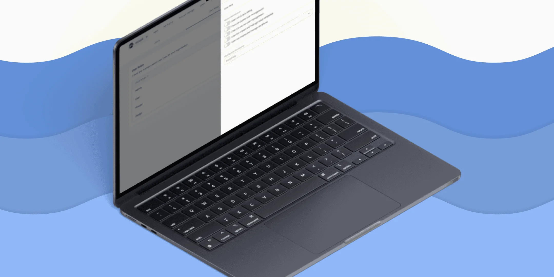
Ashore Releases Advanced User & Team Management
Increase Your Output With Creative Automation Software
How to Write a Follow-Up Email After No Response From Client
Ashore Improves Email Deliverability With Newest Software Update
Create A Strong Internal Approval Process With These Tips
Should You Post Your Brand Collateral On Social Media?
Just Released: Google SSO, Checklist Targeting, and New UI
From Idea to SaaS with Cody Miles of Ashore
Is Print Marketing A Dying Art?
The Sales Collateral You Need
Press Release | Releases New Custom Fields Feature
This Checklist Makes Website Proofing a Breeze
How to Start Your Own Marketing Agency: Three Tips From a Pro
Digital Marketing Collateral Ideas for When You Can’t Look at an Email
A Print Proof is Non-Negotiable
Press Release | Now Supports Multiple Languages
Make the Most of Your Brand Imagery
We Need To Talk About Email Client Correspondence
Breeze Through the Label Proofing Process With an Amazing Design
Everything In House Design Agencies Need For Success
What Does Your Social Media Style Guide Need?
To Let Your Words Shine, Learn the Basics of Copy Design
The Collaboration Skills Checklist for Creative Teams
Press Release | Introduces New Version Control Feature
Oh, The Places You’ll Go: Freelance Vs. Out Of House Vs. In House Ad Agency
Press Release | Ashore Announces New Integration With Loom
Seven Projects To Refine Your Graphic Design Process
Press Release | Announces the Release of Live Web Proofing
The Iron Triangle Of Design Project Management
How To Increase Workflow Efficiency Without Killing Creativity
Consider Intuitive Design When Building Your Website
End The Endless Cycle Of Design Revision
New Year, New Brand? The Fundamentals of Successful Rebranding
At the Beginning of the Creative Design Process, Ask Your Client These Questions
Your Creative Agency Process is in Need of an Upgrade
What Do the Fonts You Use Really Say About You?
What To Do When You're At Your Creative Capacity
Learning to Swim With Project Management for Creatives
The Trouble With PDF Proofing No One Likes to Talk About
Make a Modern Content Management Workflow Creatives Actually Like
Ashore Announces Four New Features
Bolster Creative Team Management With Proofing Software
We’re Tired Of Zoom Making Us Tired
Principles of Effective Communication During the Proofing Process
Approval Management Software and Navigating Cross-Functional Teams
Cover Your Bases With a Formal Web Design Approval Process
Case Study: Ashore Helps Captain Notepad Chart a Faster Course
Fighting Creative Blocks in Collaborative Design
The Ultimate Guide to Creating a Simple Graphic Design Contract
15 Examples of Client Feedback (And What They Actually Mean)
Diagnose the Pain Points of Your Creative Workflow
The Packaging Design Process Looks A Little Different
Augment Creative Workflow Management With Approval Software
Incorporate Approval Software into Your Scope Management Plan
On Managing Workflow Effectively During the Approval Process
Simplify Your Client Email Follow Up Sequence
Video Review and Approval for Now and in the Future
Include Clients in the Project Design Process
The Trick to Faster Client Approval Sign Off?
Is Print Collateral Still Important?
Does Your Process Include a Graphic Design Proof Approval Form?
Make Design Collateral Great Again
Manage Project Expectations on All Sides
You Need to Invest in Marketing Resource Management
Moving Your Creative Development Process Online
How Can Each Printing Proof Improve Your Approval Process?
Distributed Teams Need Virtual Collaboration Tools
The Power of Enlisting a Graphic Design Project Checklist
Ashore vs. ConceptShare
Ashore Vs. GoVisually
5 Items That Should Be On Your Client Sign Off Checklist
5 Features You Didn’t Consider in Online Design Sign Off Software
Which Design Collaboration Tools Give You the Best Proofing Experience?
How Online Proofing Software for Printers Helps Your Business
Collaborative Image Commenting Saves the Proofing Process
Ashore Versus Ziflow
Before the Proof: The Prologue of the Project Approval Process
Creative Agency Software: Ashore vs. File Stage
Approval Process Software Can Fix Your Productivity Problem
Creative Agencies, What Are You Even Doing Without Ashore?
The Most-Asked Questions About Ashore
Use Workflow and Document Management to Finish Your Projects
What You Should See in Your Collaborative Design Platform
The 80s Called. They Want Their Marketing Back.
Online Proofing Tools: The Hero of Printing After Covid-19?
Press Release | Ashore Introduces Automatic Rasterization of PDF Files
Ashore App Improves Digital Collaboration with Mentions Feature
Ashore Announces Integration With Zapier
Press Release: Ashore App and Function Point Announce Partnership
Mastering the Digital Proof: Ashore 2 vs. Ashore 3
Online Proofing Can Make Everyone's Day Easier
Alleviate the Challenges of Video Proofing
Virtual Sample Software Gets Your Designs to Print Faster
Online Ad Proofing for the Uninitiated
The 4 C's of Creativity (And How Design Feedback Tools Help)
Ashore Reinvents Online Proofing With Version 3
Integrate Your Project Management Tool With Creative Approval Software
Tell Right From Wrong With All These Types of Printing Proofs
Use a Proof Software that Improves Feedback
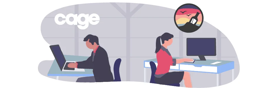
Ashore vs. Cage App
Take Your Shop Digital with an Online Print Proofing System
Image Proofing: a Guide to File Types
How to Build the Best Creative Approval Process for You
The Future Online Proofing System
Ashore vs. PageProof
What You Should Find in the Best Print Shop Software
The Free Online Proofing Experience with Ashore & QuickReviewer
Protect Your Proofs in the Client Approval Process
Workflow Management for Creatives
Project Feedback You Can Actually Use
Ashore Proofing Software Reaches 1,000 Users
Project Tracking Software's Unique Capabilities for Creatives
Which Online Proofing Software is for You: GoProof vs Ashore
What Makes a Useful Team Collaboration App?
Top 10 Collaboration Tools for Creatives | Ashore Proofing Software
Integrate Dropbox & Google Drive With Ashore
Online Proofing Software Application Ashore Launches in Public Beta
Ashore Wins Two Document Management Software Awards
Approval Workflow Software is the Future of Agency Life
Online Approval Software Solves the Agency Dilemma
Coffee Taught Me How to Code
The Approval System Software That Will Make You Money
Project Management Software Murdered the Approval Process


