Streamline projects with workflow management tools
Set up custom approval workflows that route your projects to the right people automatically. Our workflow management tools reduce bottlenecks, eliminate confusion, and get projects approved faster than ever.

Custom approval routing and stages
Scheduled proof delivery and automatic reminders
Per-stage approval flexibility
Real-time progress tracking
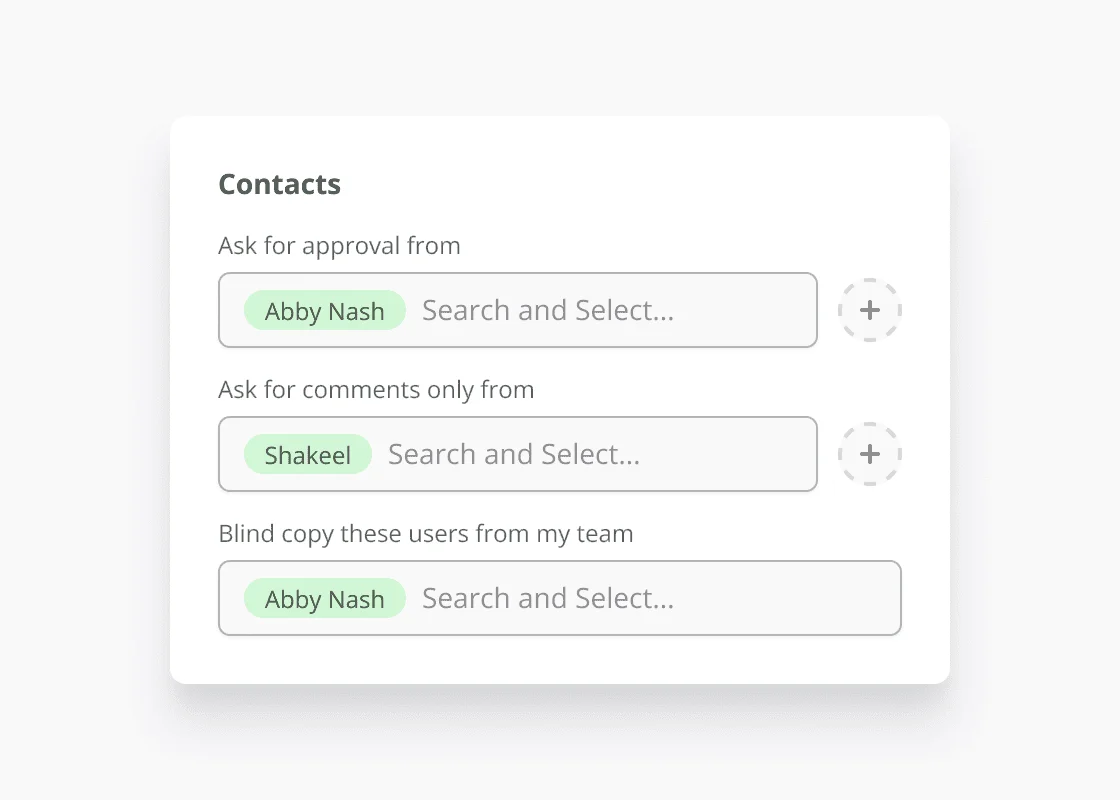
Send projects to the right people at the right time
Define custom approval stages and automatically route projects to the correct stakeholders based on project type, department, or any custom criteria you set up. Schedule proof delivery for a future date and time so approvers receive files exactly when you want them to.
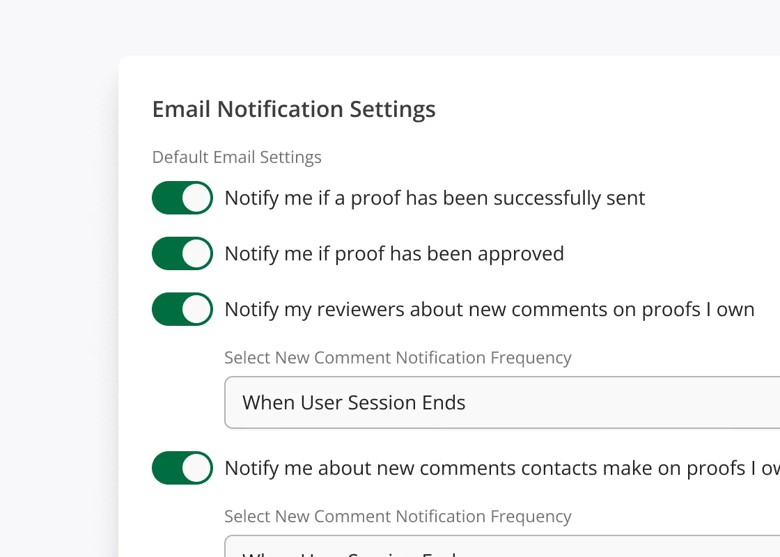
Never miss a deadline again
Automatic notifications keep everyone informed about pending approvals, upcoming deadlines, and project status changes. Set custom reminder schedules that work for your team.
Advanced Workflow Management Tools for Tracking
Real-time dashboards show you the status of every project in your workflow. Our workflow management tools help identify bottlenecks, track performance, and optimize your approval process continuously.
Workflow Management FAQ
Common questions about setting up, managing, and optimizing approval workflows and automation.
Create workflow templates based on project type, client requirements, or departmental needs. Define approval stages, assign specific approvers to each stage, set deadlines, and configure whether stages run sequentially or in parallel. Templates can be reused for similar projects.
Getting started is fast and fun with Ashore
Start streamlining your creative approvals today and see the difference.
BTW, you'll be mad you didn't do this sooner.