What Do the Fonts You Use Really Say About You?
Last updated on by Cody Miles

Get Started with Ashore
Transform your creative workflow with automated approvals and real-time collaboration tools.
A good design is sure to evoke an emotional reaction, whether it be happiness, power, comfort, adventure, or even anger. To accomplish this, designers make use of a variety of different elements such as shape, composition, or color.
For example:
- Yellow is energetic and cheerful
- Circles convey community, unity, or love
- Vertical lines communicate strength
All of these design elements are relatively well-known, but we don’t often think about the emotional impact of one integral element: fonts.
Font Psychology
Font psychology can be described as the emotional reaction viewers have to the fonts they see. Different fonts have the ability to impact our thoughts, feelings, and behaviors in unique and sometimes very specific ways — that’s what font psychology helps us understand.
When you know how people react to fonts, you’ll be able to make your designs that much stronger and have more control over how they are perceived.
To help you get started, we’ve broken down the psychology behind some of the most popular font families below.
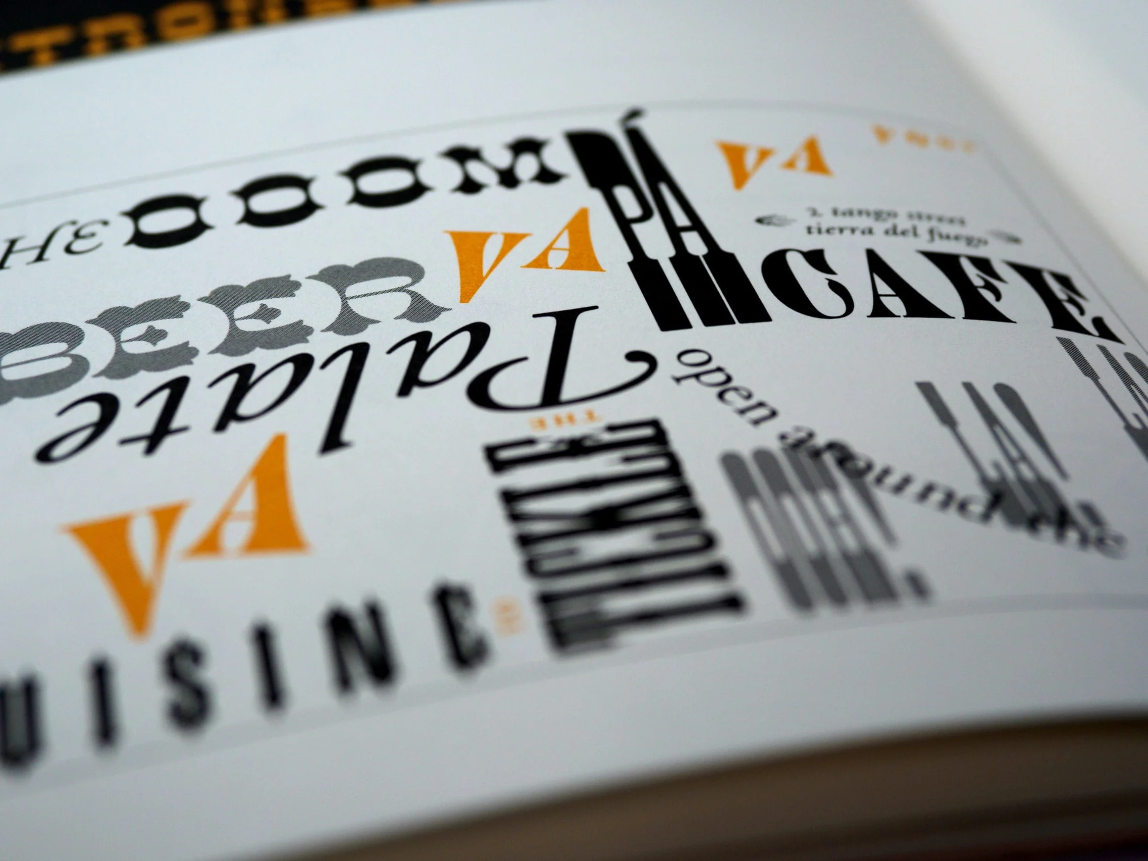
WTF? (What the Font?)
Serif Fonts
Examples: Times New Roman, Georgia, Garamond
Serif fonts are considered to be some of the most traditional of your font options. They’re usually used to create a classic, traditional, or stable feeling in a design.
When we see serif fonts, we’re most likely to feel a sense of:
- Trustworthiness
- Respect
- Authority
- Formality
If you’re designing something for a well-established business, or you’re attempting to evoke knowledgeability and authority on a subject, serif fonts will be your best friend.
If you’re looking for a font that bridges the classic look of serif with a more youthful vibe, slab serif fonts are a great choice. In slab serif fonts, the serif is squared off, making it look chunkier and bolder.
Examples of slab serif fonts: Courier, Rockwell, Museo.
Sans Serif Fonts
Examples: Arial, Century Gothic, Helvetica
Simply by removing the serif, sans serif fonts communicate a clean, modern feeling in your designs. They manage to straddle the line between minimalistic and engaging, between openness and straightforwardness.
When viewers see sans serif fonts, they may feel a sense of:
- Modernity
- Progress
- Sophistication
- Innovation
You’ll often see sans serif fonts used by tech companies and other brands who consider themselves modern and forward-thinking. When older companies refresh their branding, it’s common for them to adopt a sans serif font and retire their serif typeface.
Examples of this trend: Delta, Google, Burberry.
Script Fonts
Examples: Lucida Script, Lobster, Zapfino
Script fonts are known for being fun or romantic (or both). With their graceful, swirling lines, they evoke feelings of femininity and elegance, but their hand-written appearance can also communicate creativity.
When someone sees a script font, they’re most likely to feel a sense of:
- Romance
- Whimsy
- Fanciness
- Light-heartedness
Due to their potential to evoke deep emotion, script fonts can be a fantastic option for visual brands — but don’t overuse them. Their artful, fanciful appearance can quickly become visually overwhelming and even make the copy illegible.
Get Out There and Font It
There are hundreds of thousands of different fonts for you to choose from when creating a design. By better understanding font psychology, you’ll be able to find the font that makes your words and your design come to life.
And if you’re still not sure if your design rocks, don’t be afraid to reach out for a second or third opinion. Ashore has helped thousands of designers automate and manage the proofing process.
With:
- Easy-to-use review links
- Threaded comments
- Version comparison
…you’ll have everything you need to enable a fast, productive review process.
Sign up for a free Ashore account today, and start flaunting your font psychology knowledge in your designs.